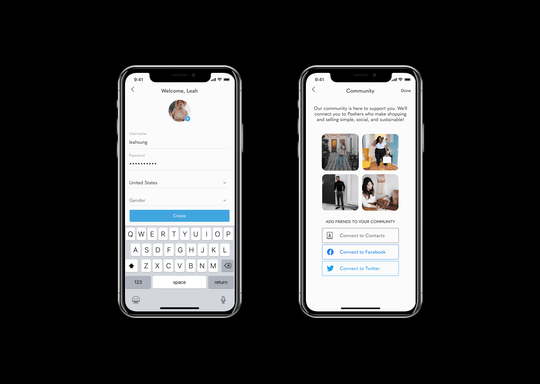
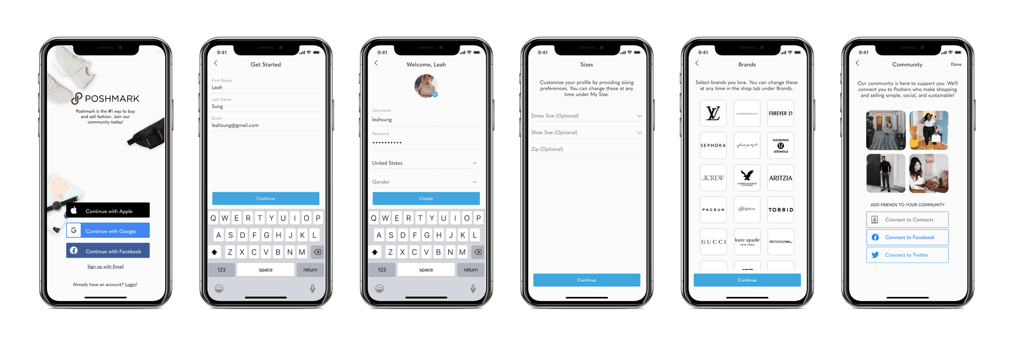
New sign up flow that improved registration completion by 25%.
Timeline
June 2021 - Aug 2021
Tools
Figma, Zoom, Slack, Google Suite
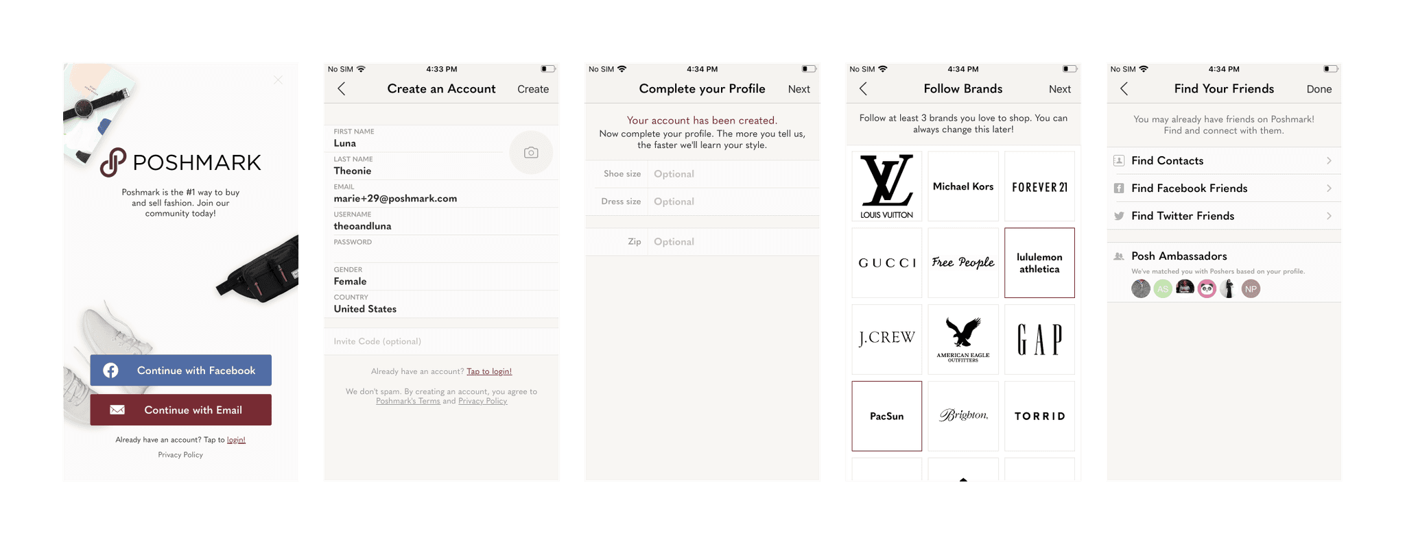
Before Redesign
After Redesign
Problem Statement
How might we improve the onramp experience to better educate, retain, and delight users, with a focus on Gen Z?
Why Gen Z?
Millennials and Gen Z adopt secondhand items 2.5 times faster than any other consumer. The existing design isn't optimized for Gen Z values and aesthetic preferences, evidenced by Poshmark's user base skewing heavily millennial.
User Research
My research plan included a competitive audit of 12 apps, 3 user interviews, and a focus group with 3 Gen Z users.
The main research goals were to understand which questions to ask during onramp to efficiently create the optimized feed and identify Gen Z pain points, goals, and needs as new users.
Pain Points
Create an Account Screen is too cluttered
Would like more connection to people they follow
Want the onramp & transition to feed to be tailored to their interests
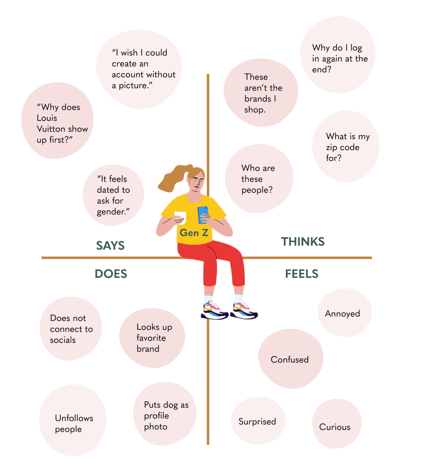
Empathy Map
Personas

Sean
Sean is a recently graduated young professional. He is looking to get into fashion but lacks motivation to shop. He is open to purchasing secondhand items but has never used Poshmark before.

Anna
Anna is a senior in college who loves fashion. She uses Poshmark primarily to sell items, and keeps up with trends on social media. She supports buying secondhand but prefers shopping at trendy retailers.

Sally
Sally is a sophomore in college. She is exploring her style and loving vintage, funky pieces. She occasionally makes purchases on Poshmark when looking for a specific item or style but does not sell.
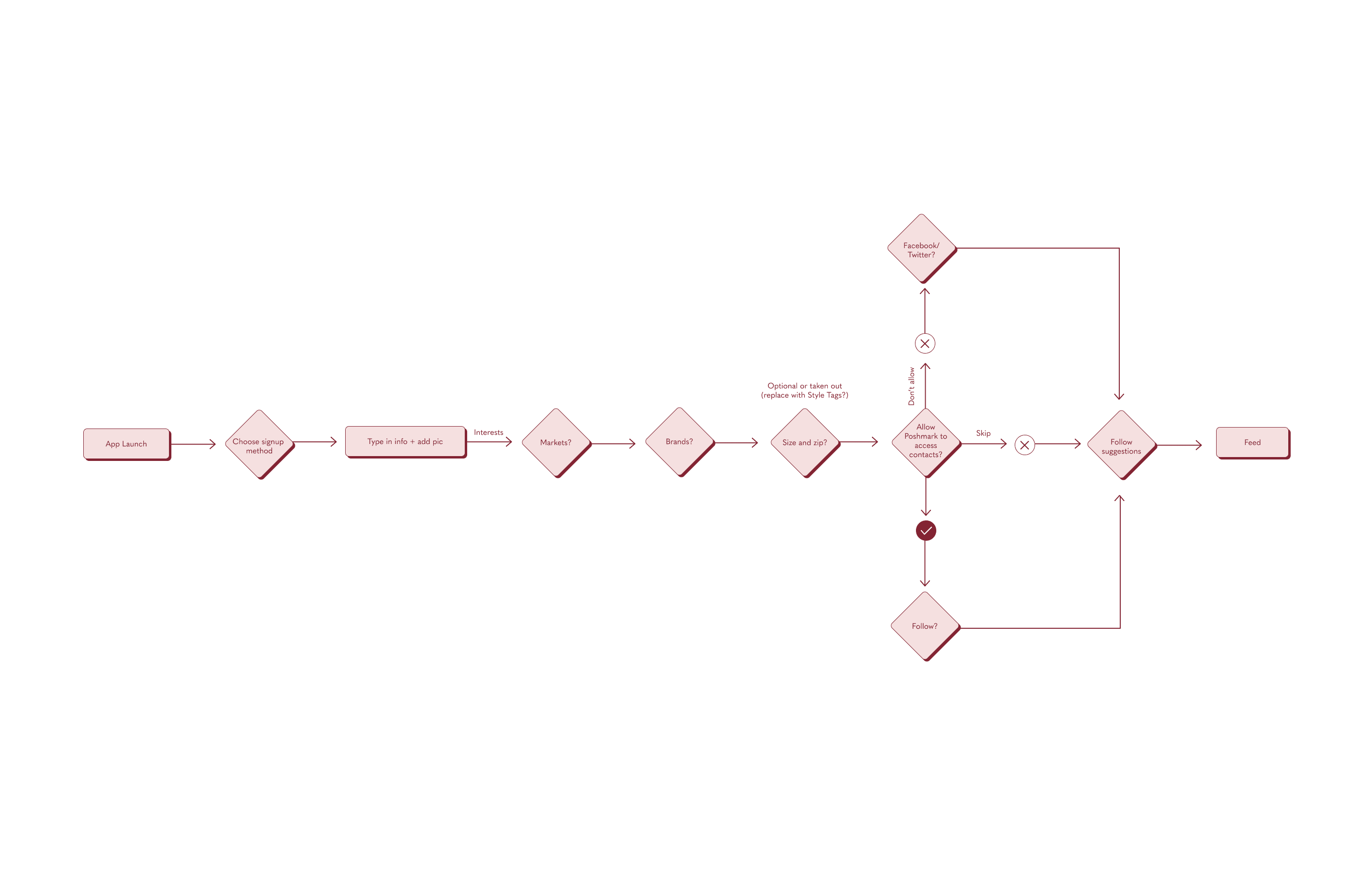
User Flows
Existing user flow
User flow with social push
Low Fidelity Concepts
Usability Testing
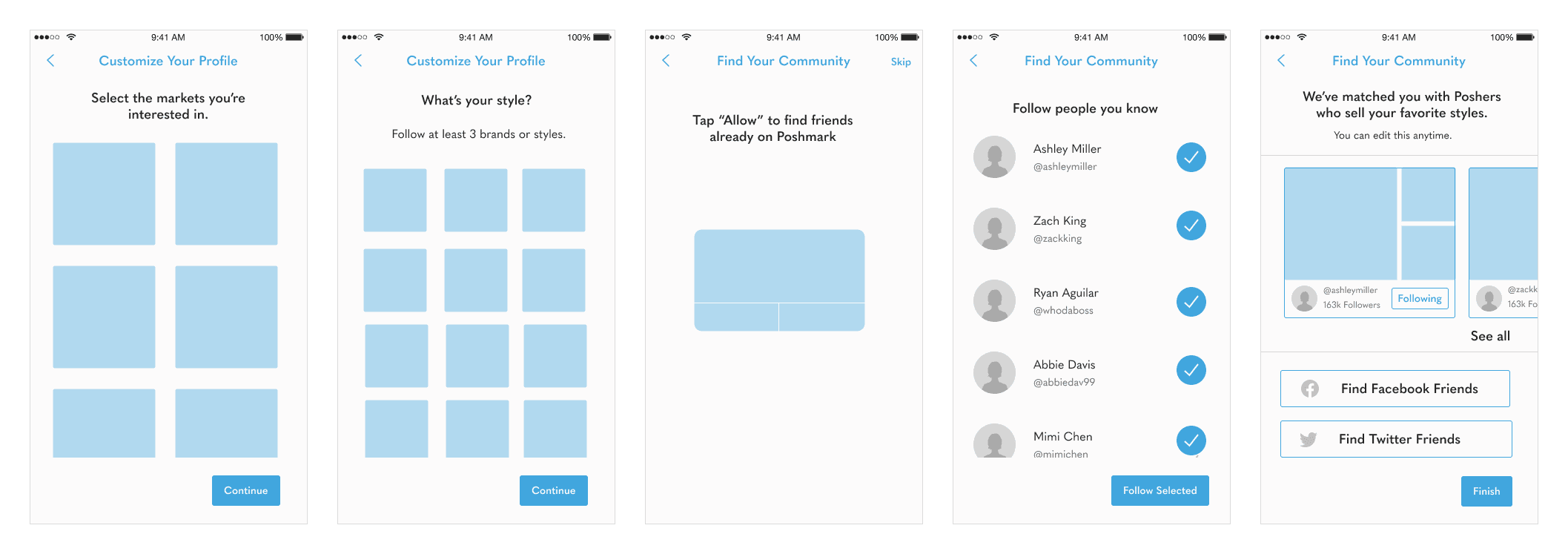
I conducted 6 usability tests with 3 interactive prototypes. The testing sessions allowed us to identify critical issues and also receive valuable feedback to inform our design. Here's what I heard:
"I like breaking signup down into multiple screens."
"Very moved by all photos."
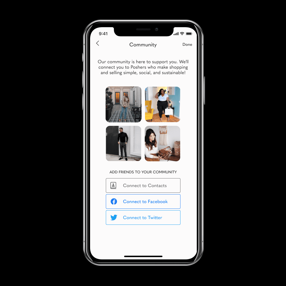
"I prefer the language build your community instead of find your community. The community element of Posh is much stronger than other platforms."
"I would only follow my best friends or influencers."
"Poshmark interface seems dated- I like this a lot better."
Feature Prioritization
With a shorter time scope and technical feasibility, we divided our initial feature into 2 release stages with the initial release focusing on features that require low effort but yield high impact, without changes to the information gathered from new users. This was facilitated by several discussions with leadership and engineering and prioritization based on usability testing.
The MVP Solution
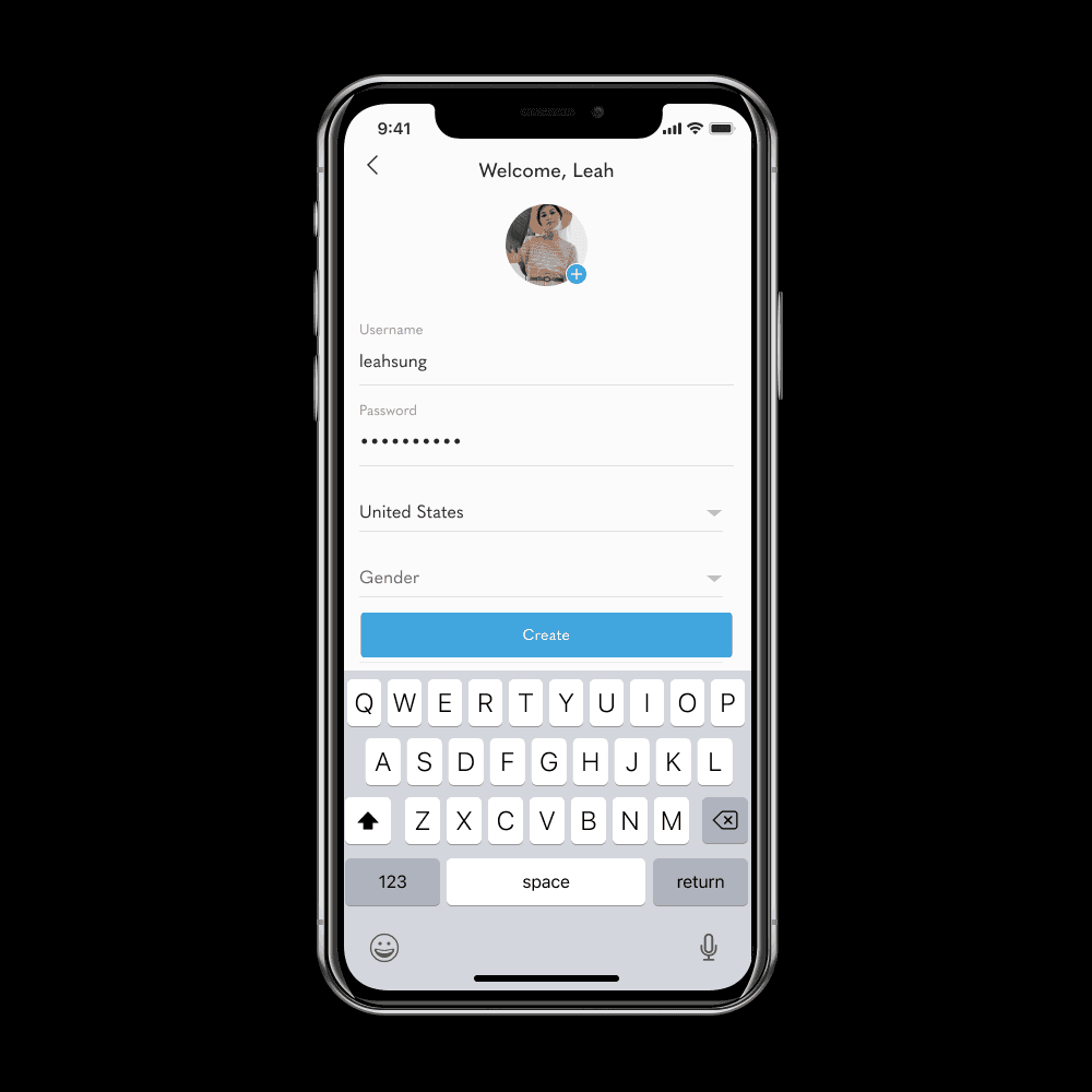
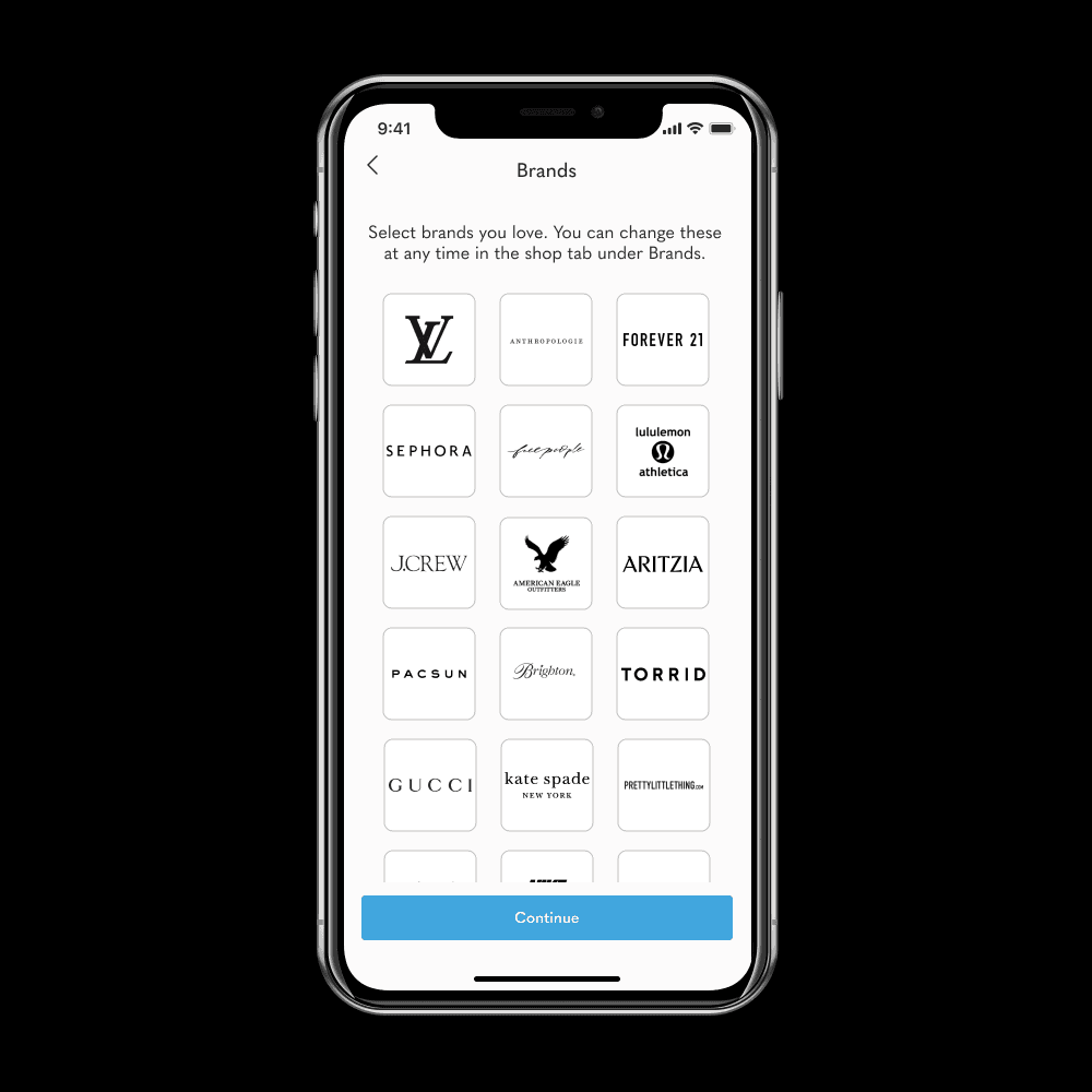
The redesigned onboarding guides first-time users through the process of creating an account and tailoring their Poshmark experience. The onramp showcases Poshmark’s vibrant community, reflects its diverse user base, and incentivizes action by providing context.
